Pledgemine by Evertrue
Product Design
Pledgemine is a direct mail product that allows Evertrue’s customers to create and manage direct mail campaigns digitally.
As a summer intern at Evertrue, my team was tasked with identifying pain points in the existing Pledgemine platform, and proposing a comprehensive redesign to improve the user experience, streamline the ordering process, and better integrate Pledgemine into Evertrue’s ecosystem of products.
Research
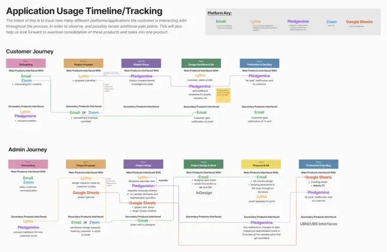
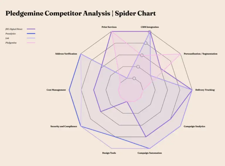
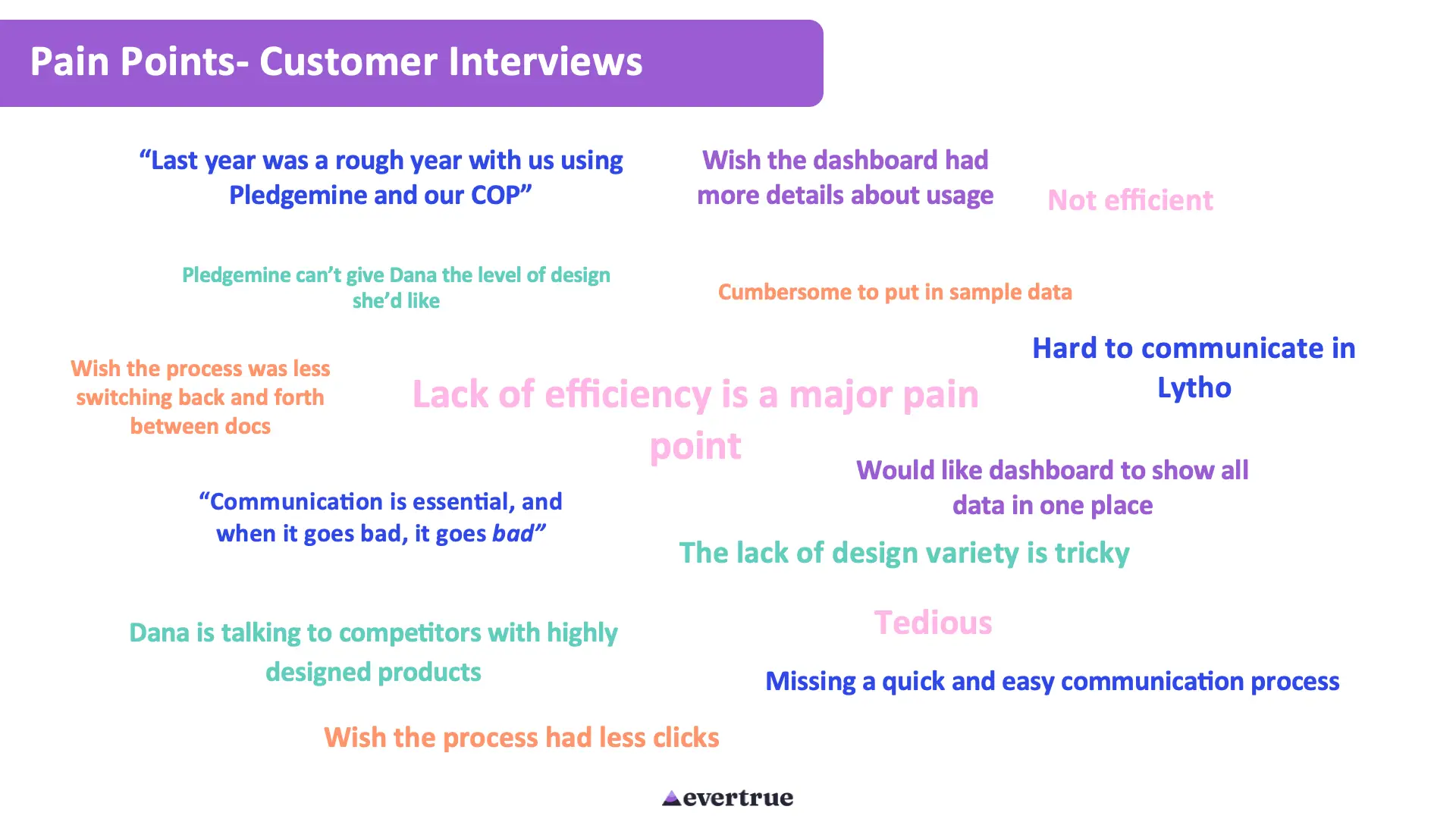
To kickstart the project, we conducted extensive research, including customer interviews, mapping the Pledgemine creation and printing process, and a competitive analysis of similar direct mail solutions. We took particular note of pain points and places where Pledgemine operations were dependent on third party software, rather than having that functionality built into the Pledgemine app.
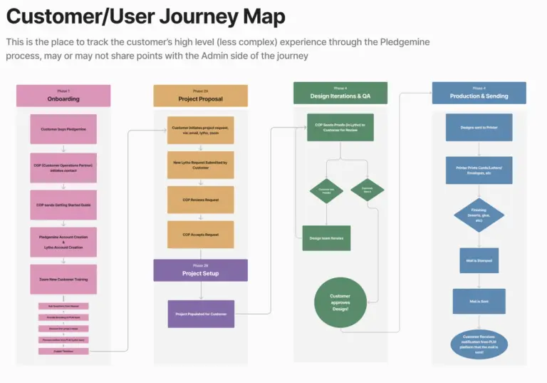
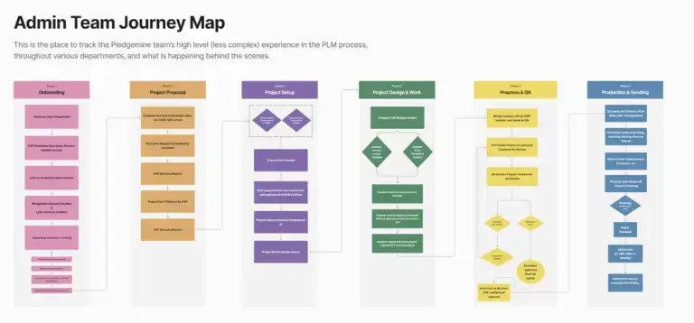
The Pledgemine Process
The process of creating and sending a Pledgemine order is quite complex.
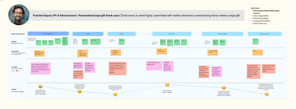
Our team spent time studying the customer’s journey from onboarding to printing an order.
Customer and admin users interact with the Pledgemine app at various points in the process, and this was the focus of our redesign effots.
Pain Points and Opportunities
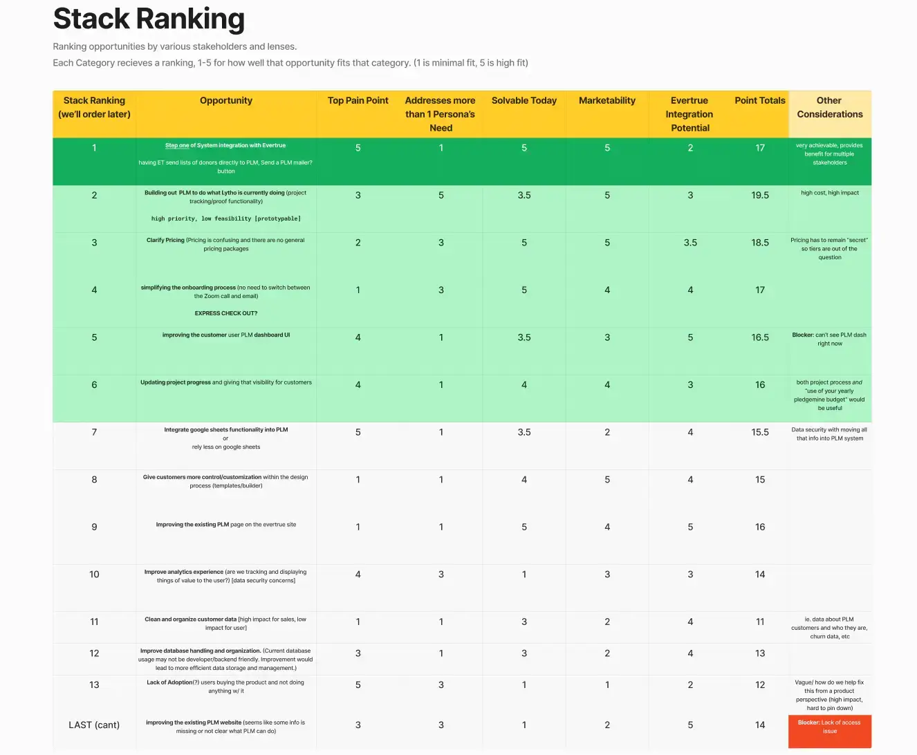
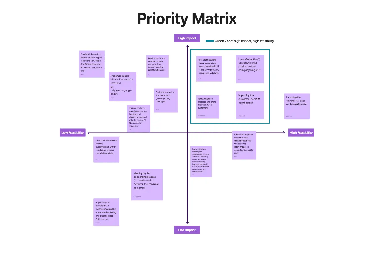
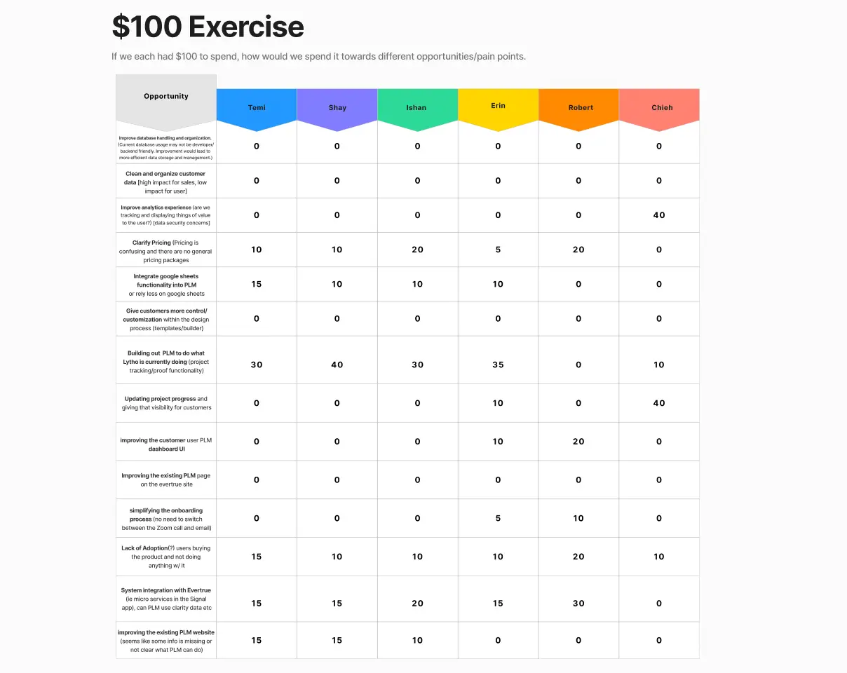
Our 6-person Intern team worked across our department disciplines (Product, Engineering, & Marketing) to assess the main pain points of the Pledgemine app, as well as the Pledgemine ordering process in general. We did a variety of opportunity assessments before beginning design or development work on the project, based on the findings of our research.
User Personas & Journey Through Pledgemine
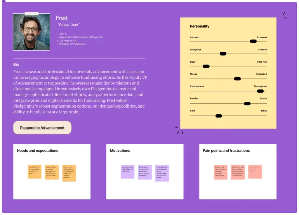
I created a few user personas, focusing on Fred (a power user) and Sarai (a dissatisfied user), and tracked Fred’s journey through placing a Pledgemine order, looking for pain points.

Opportunities for Development
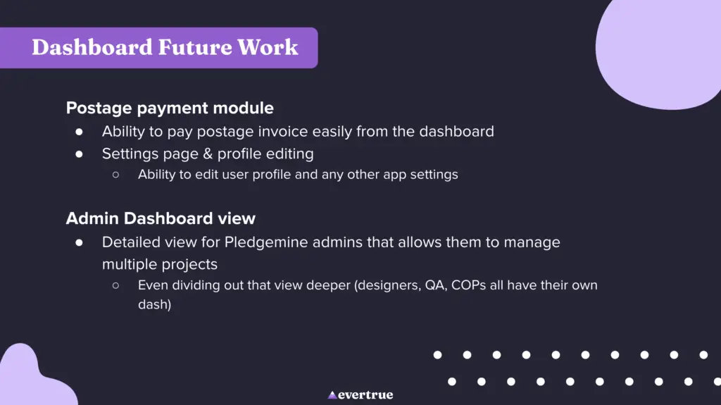
After the research process, the team settled on three areas to begin design and development of features for Pledgemine, keeping in mind that our internship was 10 weeks long.
The existing Pledgemine application offers limited functionality, and has a very outdated and clunky user experience. We aimed to overhaul and redesign the app to be more useful, including integrating the functionality of Lytho, the third-party app that Pledgemine currently uses to track mail design and proofs.
User Problem
✔As a Pledgemine user
✔I want a clean user experience, easy and efficient ordering, and a “full service direct mail” platform that integrates digital and print mediums
✔Because my work benefits greatly from direct mail and the more cost/time efficient that process can be, the better
✔But I find the current online platform’s user experience to be clunky, as well as the experience of the Pledgemine ordering process in general
✔Which makes me feel like I am paying too much for a product that is not delivering what it promises, and that there are probably other direct mail solutions that are more efficient and keep up with the times
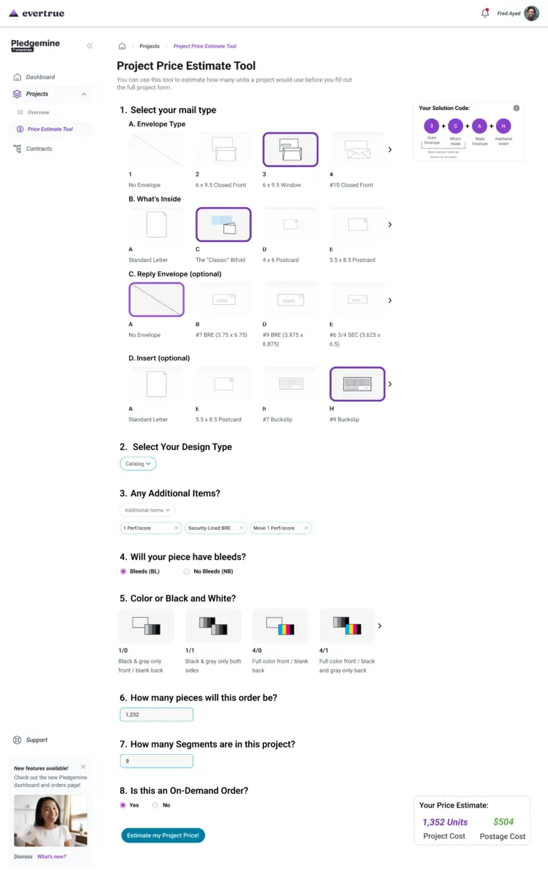
The current Pledgemine pricing structure is convoluted and hard for even return customers to understand. Every order uses a different amount of units, which a Pledgemine customer buys in a package at the beginning of the fiscal year. We created a tool to easily estimate how many units a project would cost, so that users had an easier way to budget their unit package for the year.
User Problem
✔As an existing Pledgemine customer
✔I want to estimate the approximate cost of a project quickly
✔Because that helps me budget my Pledgemine units throughout the year
✔But I lose track of/forget the project planner sheet, and don’t feel competent using google sheets, which are what pricing is currently calculated in
✔Which makes me feel like I am going into new projects blind to the amount of units they will take up, which makes me feel like Pledgemine is hard to use
Evertrue’s flagship product is a donor experience platform called Signal. One of the big addages at Evertrue is that “Signal is everything,” as Evertrue moves toward further integration of all their products. We wanted to encourage this continued integration with our work on Pledgemine, and came up with a way for Signal’s AI assistant to suggest Pledgemine-related tasks to Signal users.
User Problem
✔As a person who owns both Pledgemine and Signal
✔I want to be able to more easily move between Evertrue products and see them working together to make my life easier
✔Because I am busy and want things to be efficient, and I think that if all the products are under the Evertrue umbrella, they should be able to work together
✔But right now the Evertrue products are all separate from one another and there is little integration between the different products my organization owns
✔Which makes me feel I’m not unlocking the full potential of the products I have bought
My Design Work: Dashboard Overhaul
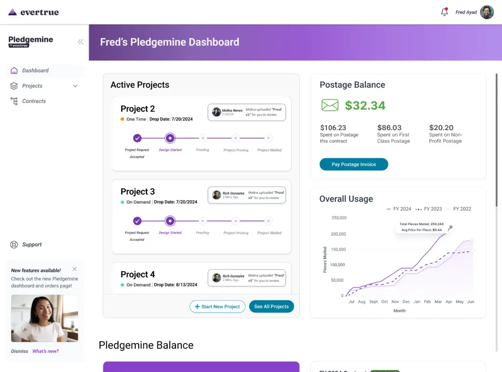
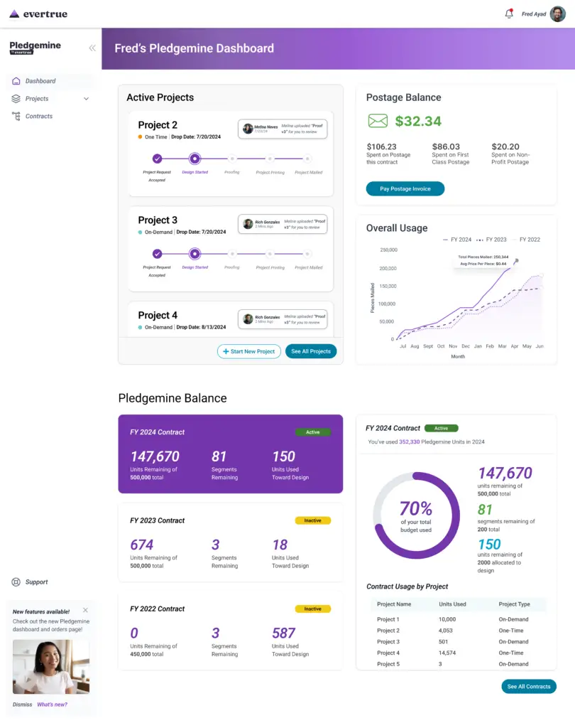
I began iterating through a variety of designs for a redesigned Pledgemine Dashboard. The main focus of the new dashboard redesign was to display a user’s mail projects and their progress prominently, along with important statistics about their Pledgemine account usage (how many pieces of mail they are sending out a year, etc). I also worked on redesigning the individual project pages, which is what displays when a user clicks into a project on the dashboard.
Existing Dashboard Design
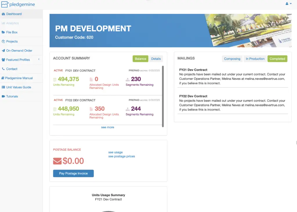
The existing dashboard has some information about account usage, but since Lytho is used for project tracking, there are no progress updates or notifications on the existing dash. Overall, the dashboard is not user friendly, and doesn’t really provide the user with information they can easily use.
Initial Wireframes
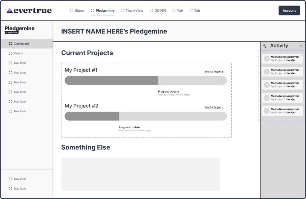
The first round of design focused on getting a general sense of the page layout and possible components it could have. I decided on a collapsable sidebar to display notifications, as certain parts of the Pledgemine process are very time sensitive, and require users to take action.
Dashboard Iterations
In the original Pledgemine dashboard, projects are not featured anywhere, even though creating and tracking different projects is a central part of user’s journey through Pledgemine.
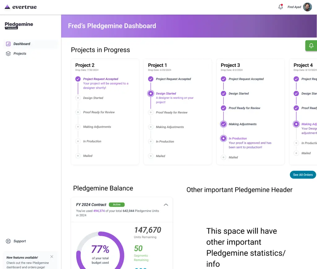
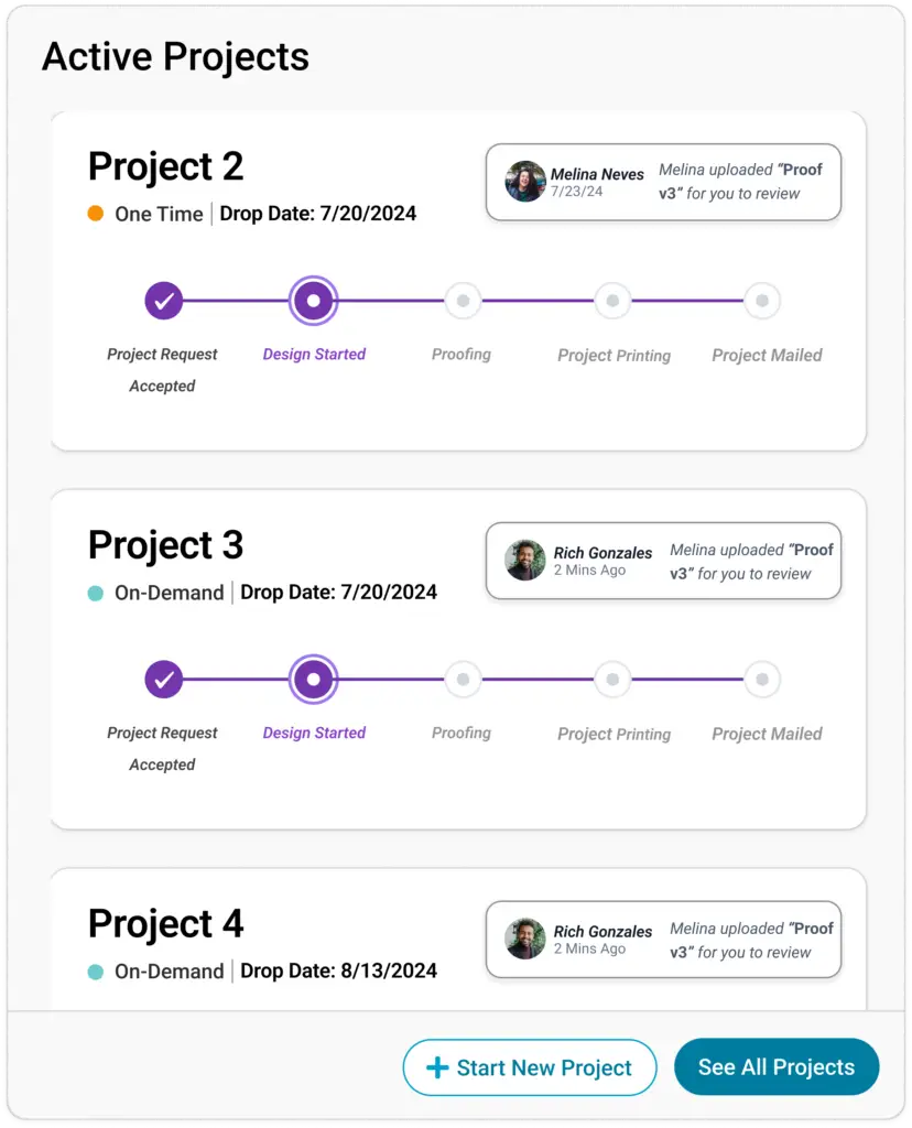
In my initial design, I centered “projects in progress” choosing a stepped progress indicator, and displaying the data previously found in the Account Summary underneath in a collapsable card.
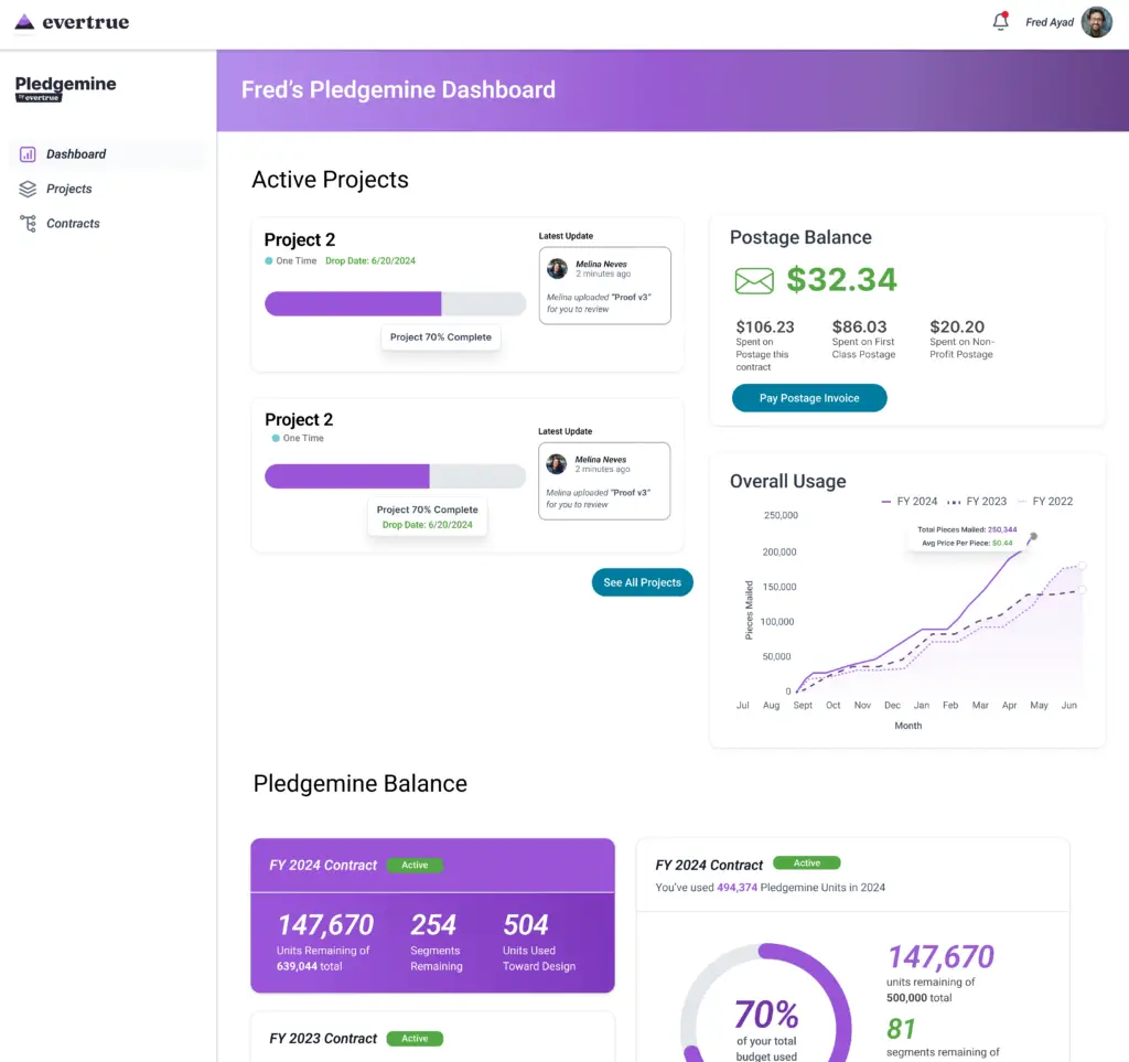
I tried a second iteration with a progress-bar style loader in a stacked display, which made room for some more data that users reference frequently.
I also changed the formatting of the Pledgemine Balance section to include at-a-glance stats from the past three years of Pledgemine use, making planning and budgeting mail campaigns easier.
User Testing and Findings
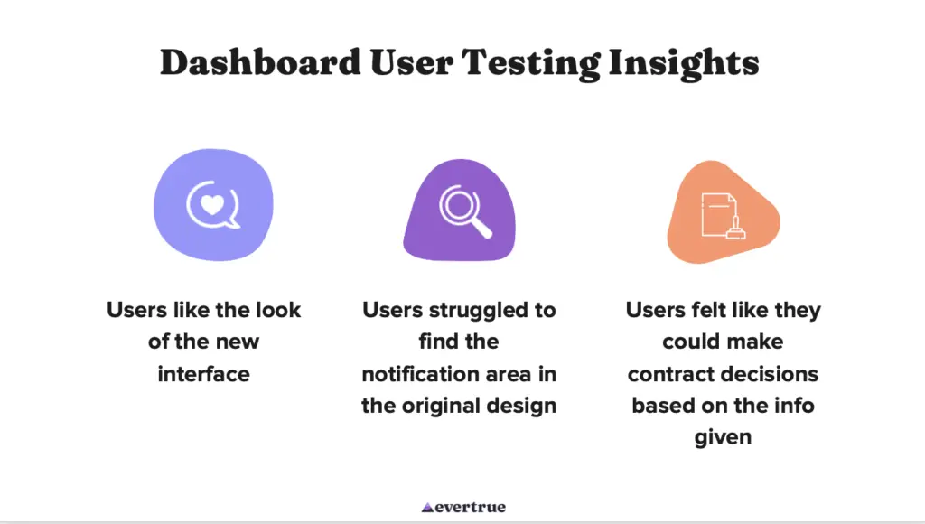
Midway through the process of design, I conducted some user testing with Maze, and gathered feedback on various flows a user might go through on the dashboard. To the right are various insights gathered through user testing about the dashboard, which I implemented in to the final designs.
Final Design: Dashboard
Component Highlights
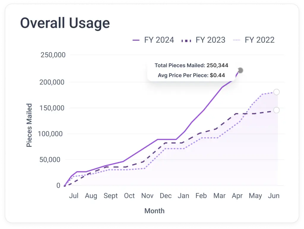
Usage Graph
Active Projects
My Design Work: Project and Contract Pages
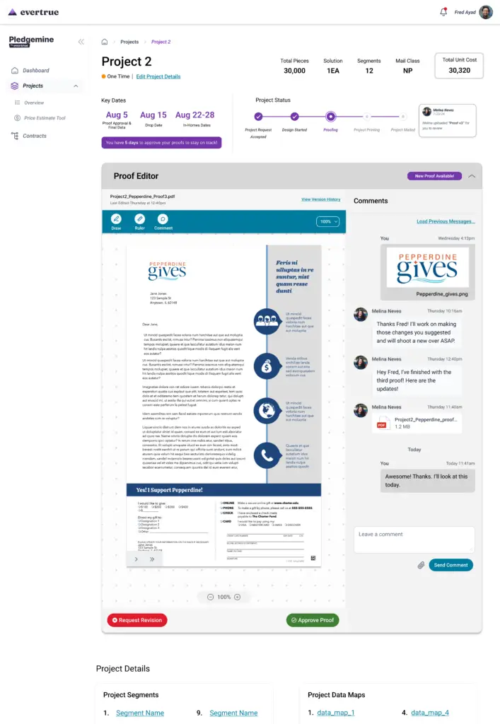
Project Page
The Project page is what one of the Active Projects from the dashboard would look like if a user clicked into it. At the top is the most important data about the project, as well as key deadlines and the stepper timeline. Underneath is a proof editor, which integrates some of the functionality of Lytho, the third party software Pledgemine currently uses to track orders and edit/review proofs
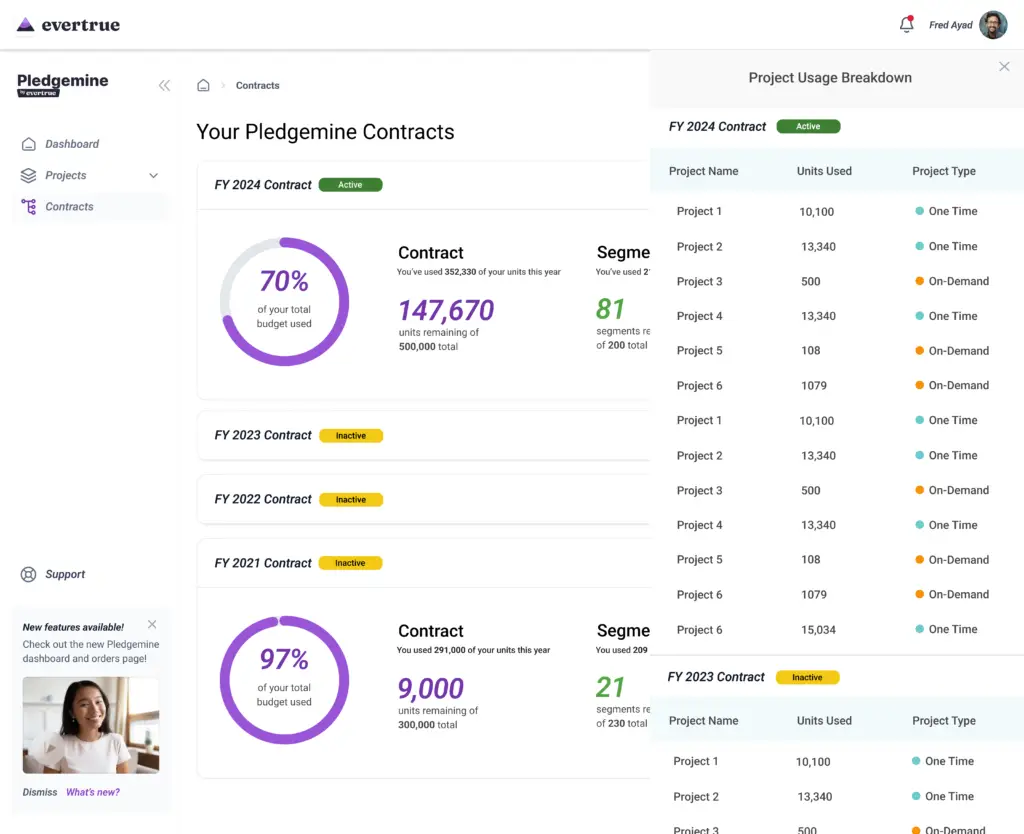
Contracts Page
The Contracts page is a deeper display of the information shown in the Pledgemine Balance module of the dashboard. It shows details of each year the user has been subscribed to Pledgemine (each year they are allotted a certain number of units to make mail with), and specific data about how their units were used for the year.
My Design Work: Pricing Tool
After work on the dashboard, I began iterating through a variety of designs for a pricing tool, using the design system and conventions from the dashboard work.
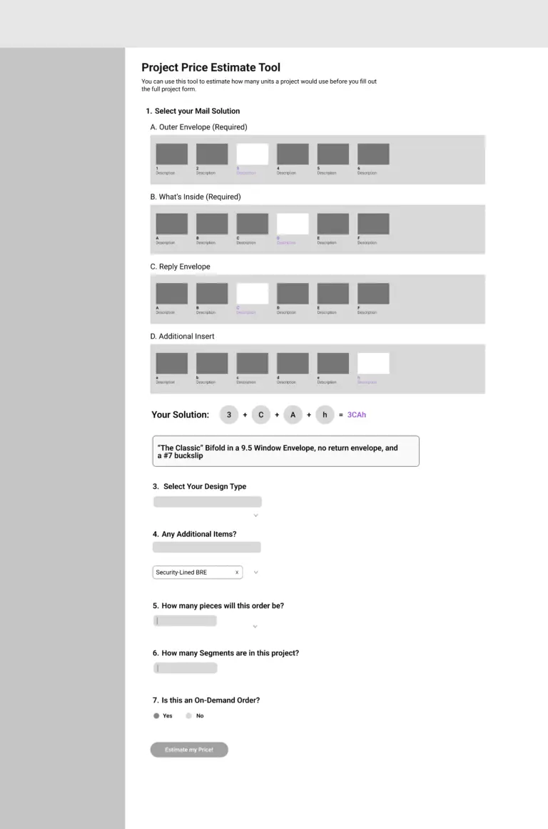
Wireframe
One of the difficult parts of the current pricing of Pledgemine orders is that there are many different envelope and letter types that have a large number of combinations. They’re currently listed in a google sheet, but there is no visual aid to help customers make their selection. In my design, I opted for a sliding menu of thumbnails for the mail options, so users can quickly select what they need visually.
This final Pricing Tool design was then passed off to the development interns, who developed it in React. The fully-functional prototype was presented to the C-Suite as a concrete deliverable at the end of our intern project, hopefully providing immediate value for users to estimate their Pledgemine costs more easily!
Reflections
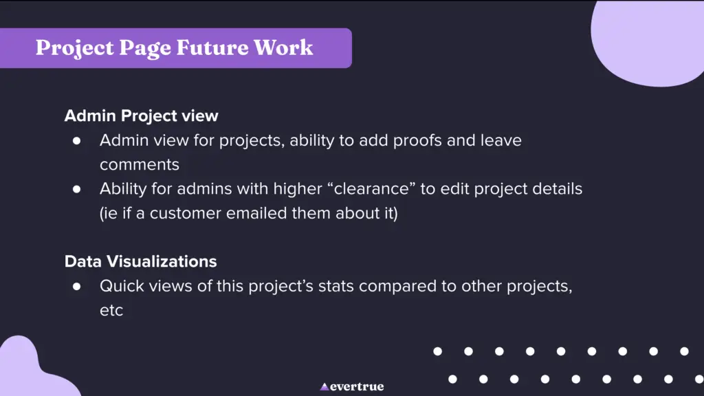
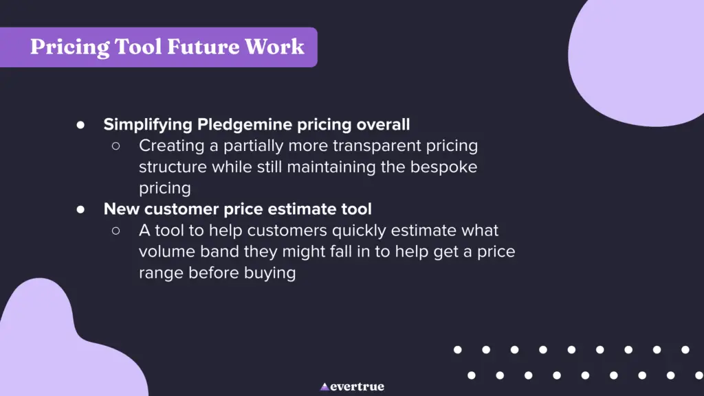
After presenting our work to leadership, we also outlined several areas for future work and improvement in the project, essentially what we would have done if we had 10 months on this project, rather than 10 weeks. A note: the mockups and process for the signal suggested tasks are not featured in this case study, as they contain features and aspects of Signal that are not yet launched to the public.

