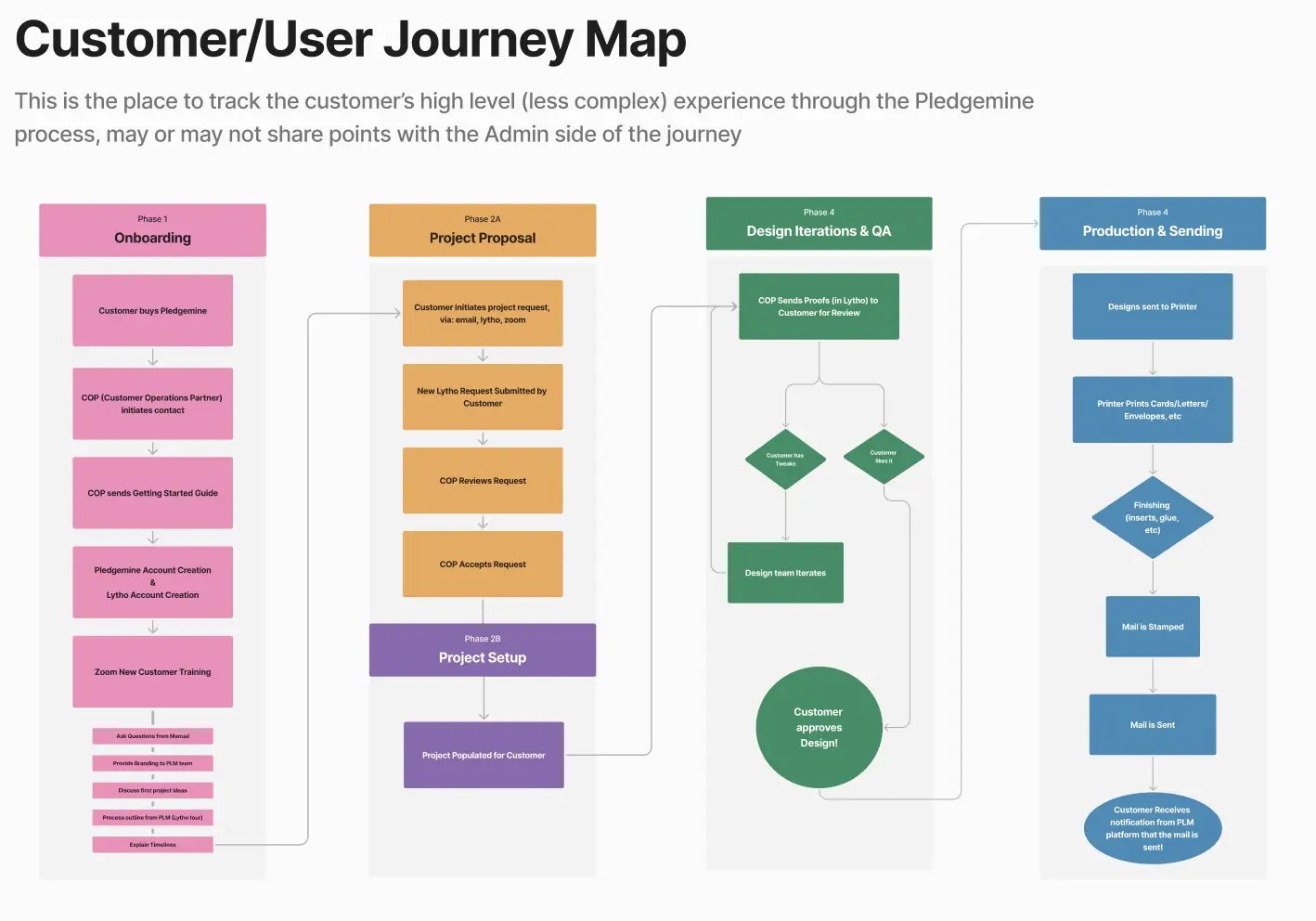
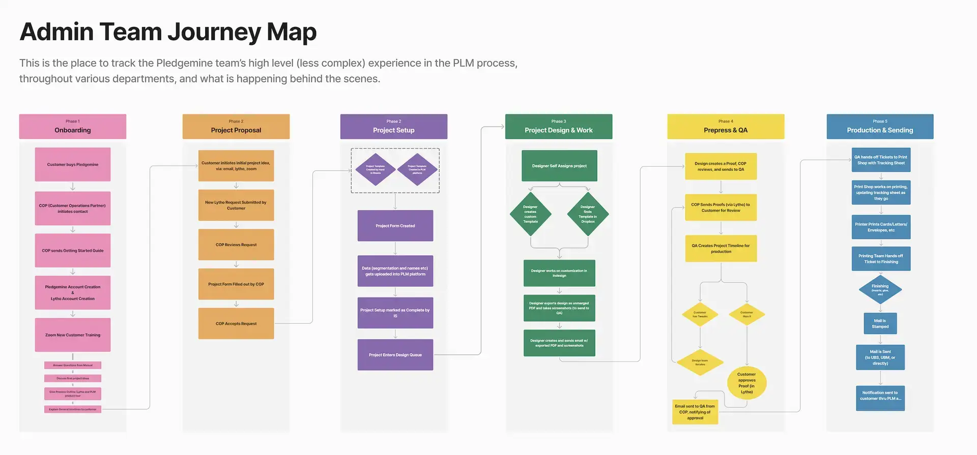
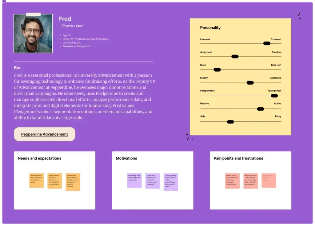
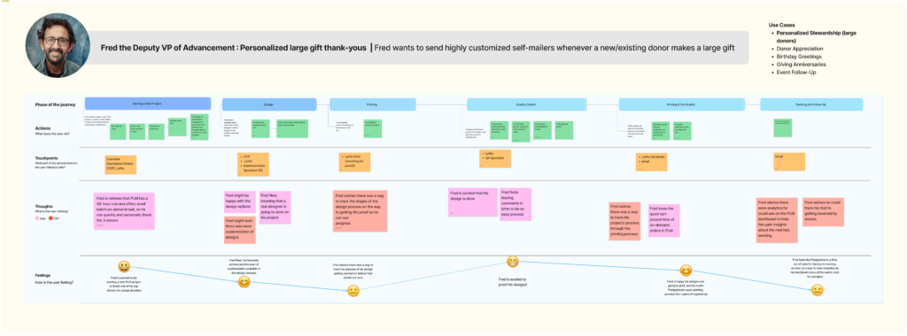
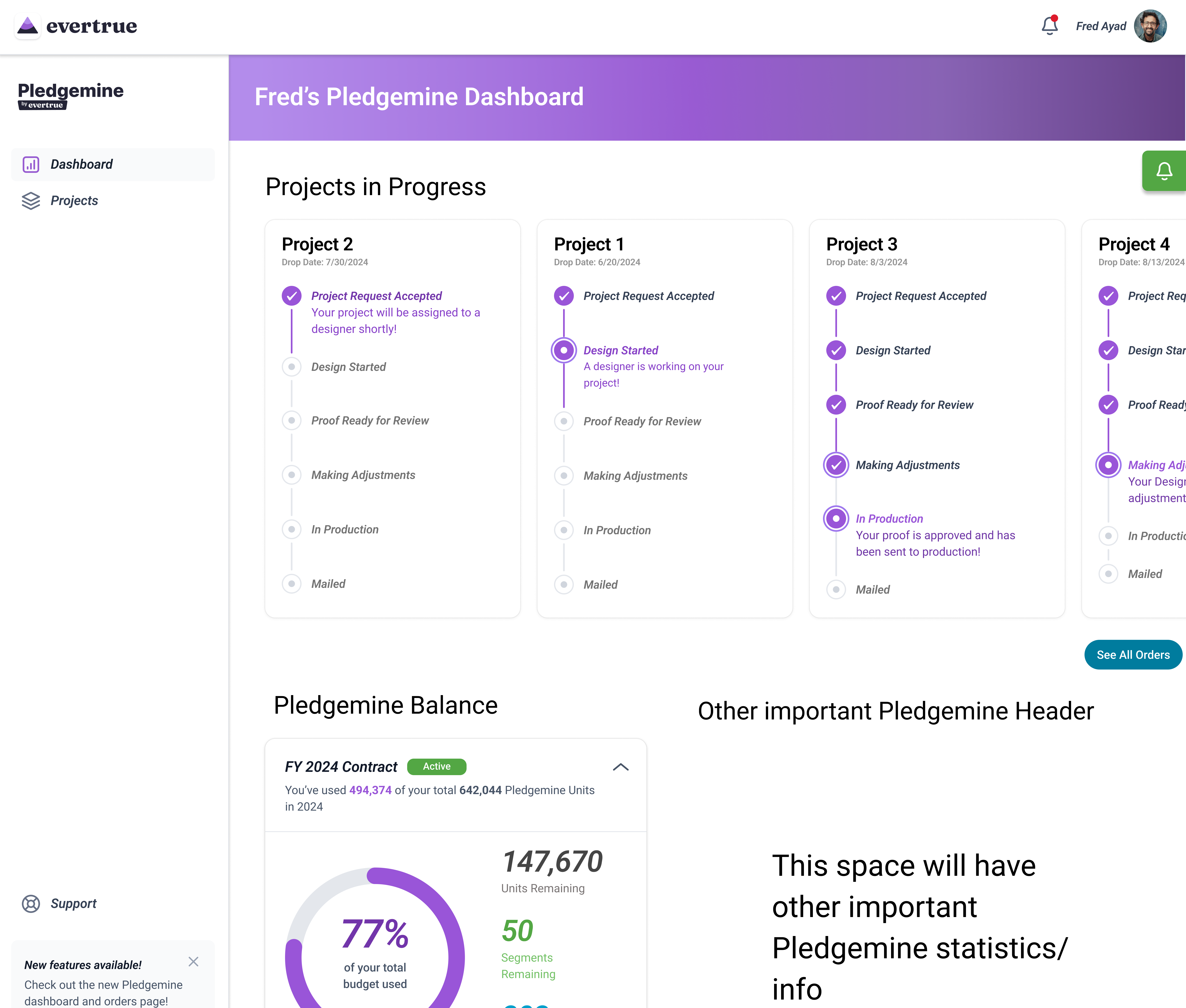
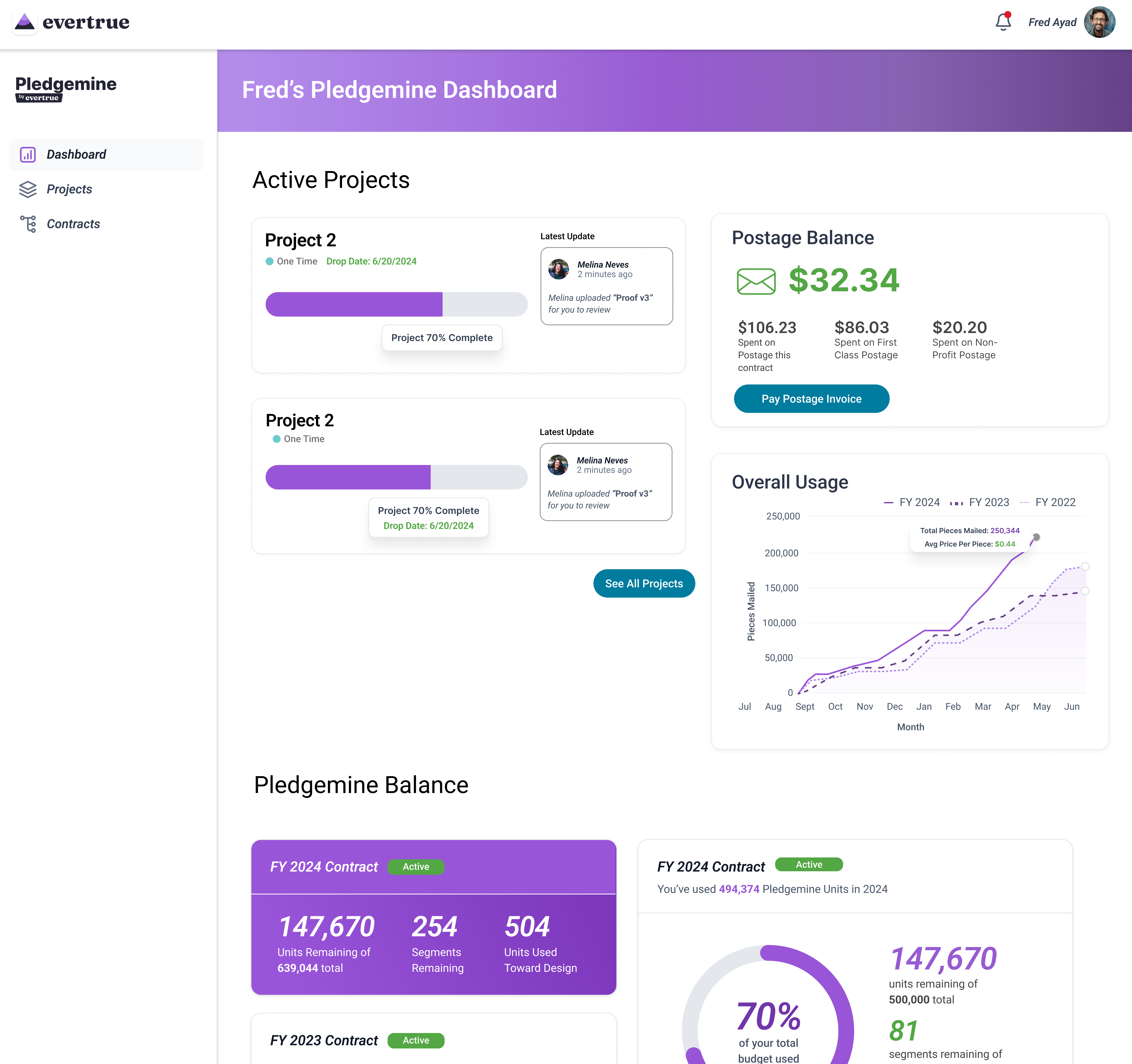
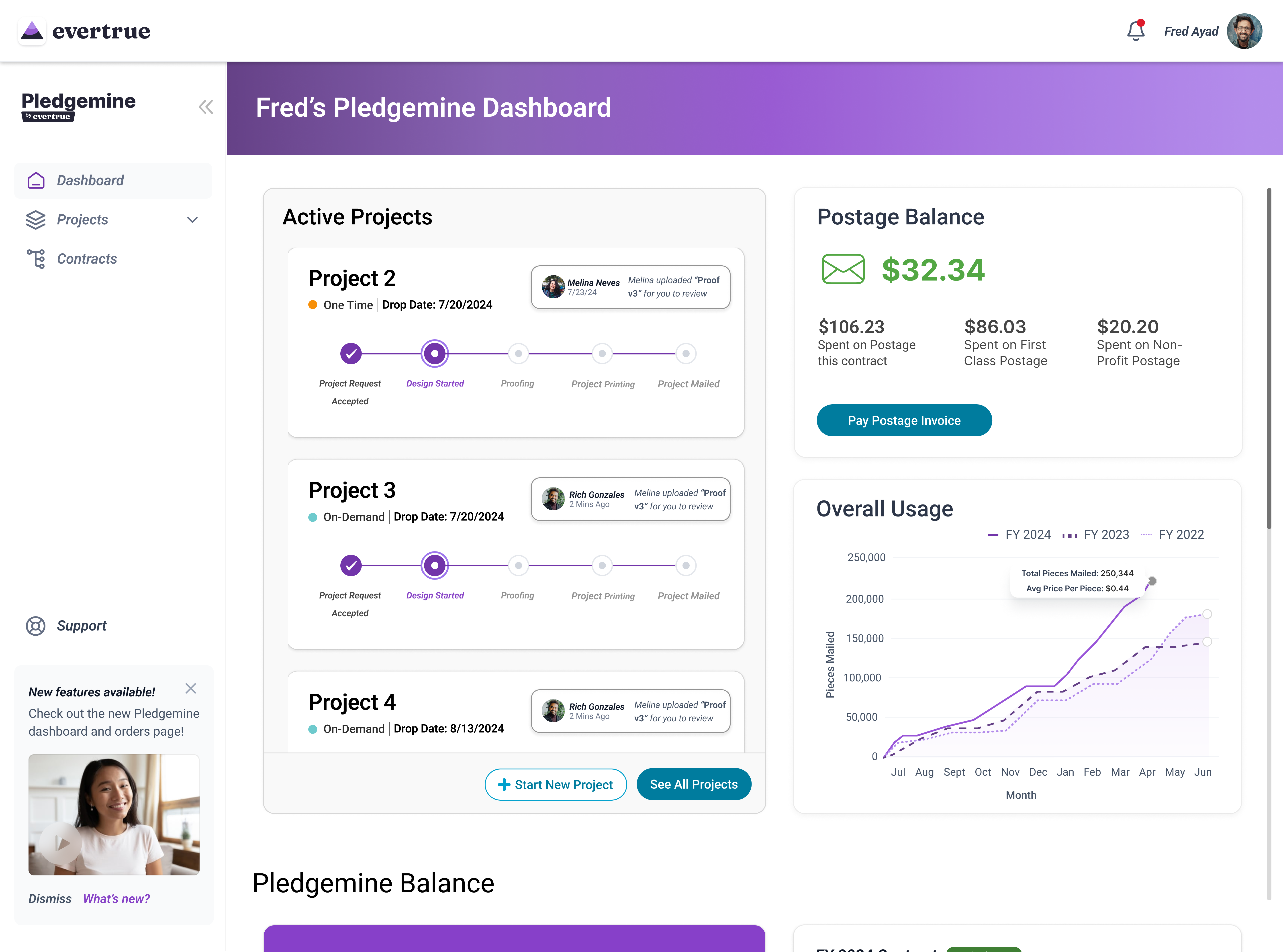
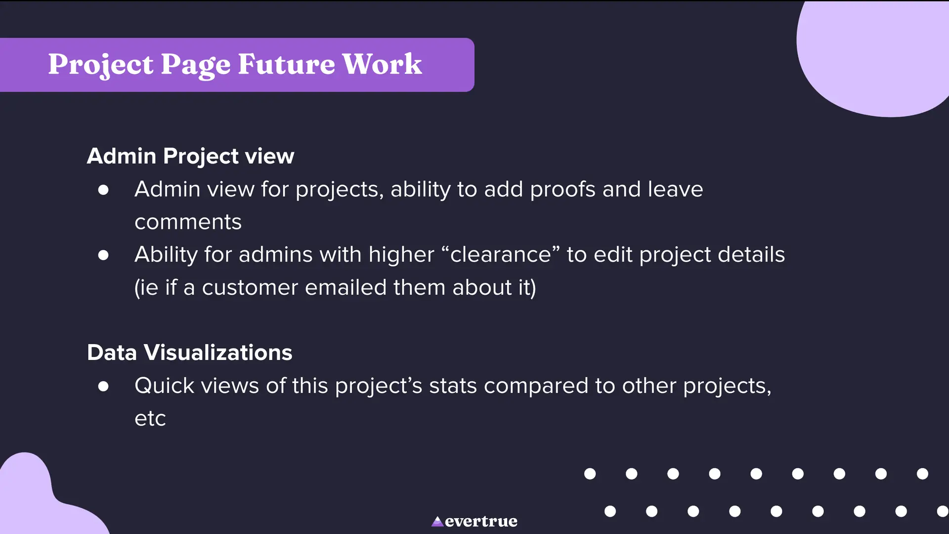
The existing Pledgemine application offers limited functionality, and has a very outdated and clunky user experience. We aimed to overhaul and redesign the app to be more useful, including integrating the functionality of Lytho, the third-party app that Pledgemine currently uses to track mail design and proofs.
User Problem
✔As a Pledgemine user
✔I want a clean user experience, easy and efficient ordering, and a “full service direct mail” platform that integrates digital and print mediums
✔Because my work benefits greatly from direct mail and the more cost/time efficient that process can be, the better
✔But I find the current online platform’s user experience to be clunky, as well as the experience of the Pledgemine ordering process in general
✔Which makes me feel like I am paying too much for a product that is not delivering what it promises, and that there are probably other direct mail solutions that are more efficient and keep up with the times
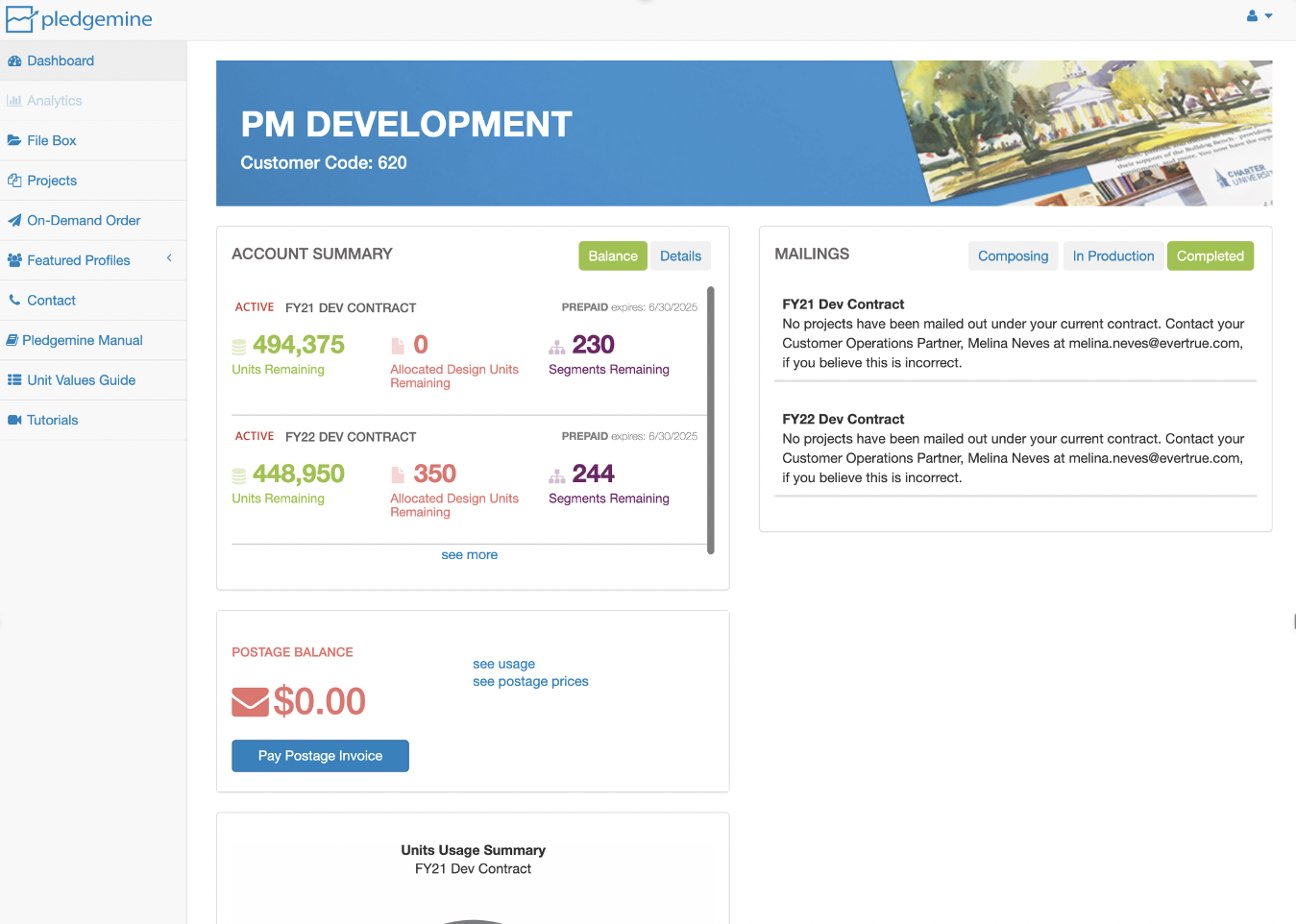
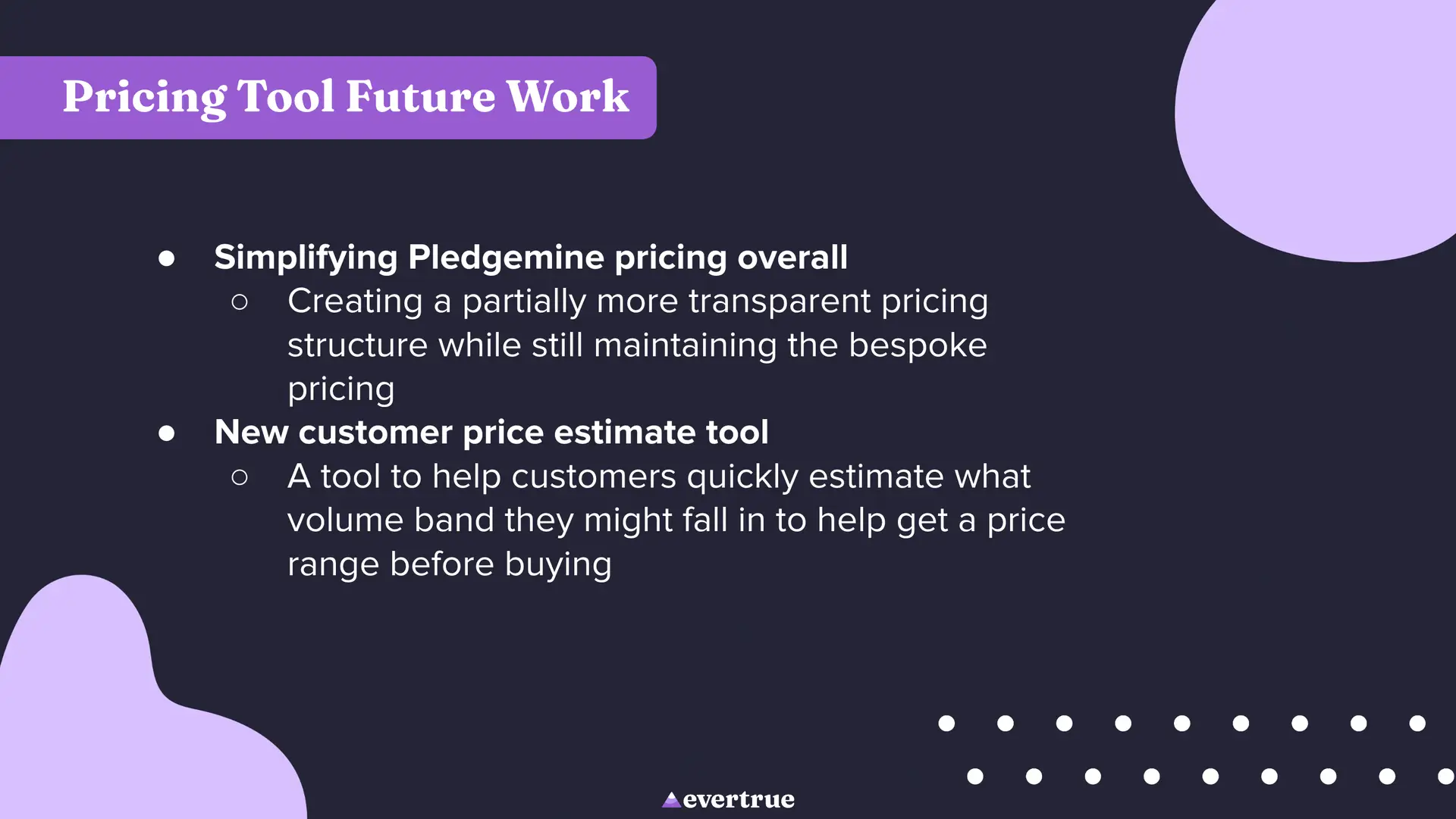
The current Pledgemine pricing structure is convoluted and hard for even return customers to understand. Every order uses a different amount of units, which a Pledgemine customer buys in a package at the beginning of the fiscal year. We created a tool to easily estimate how many units a project would cost, so that users had an easier way to budget their unit package for the year.
User Problem
✔As an existing Pledgemine customer
✔I want to estimate the approximate cost of a project quickly
✔Because that helps me budget my Pledgemine units throughout the year
✔But I lose track of/forget the project planner sheet, and don’t feel competent using google sheets, which are what pricing is currently calculated in
✔Which makes me feel like I am going into new projects blind to the amount of units they will take up, which makes me feel like Pledgemine is hard to use
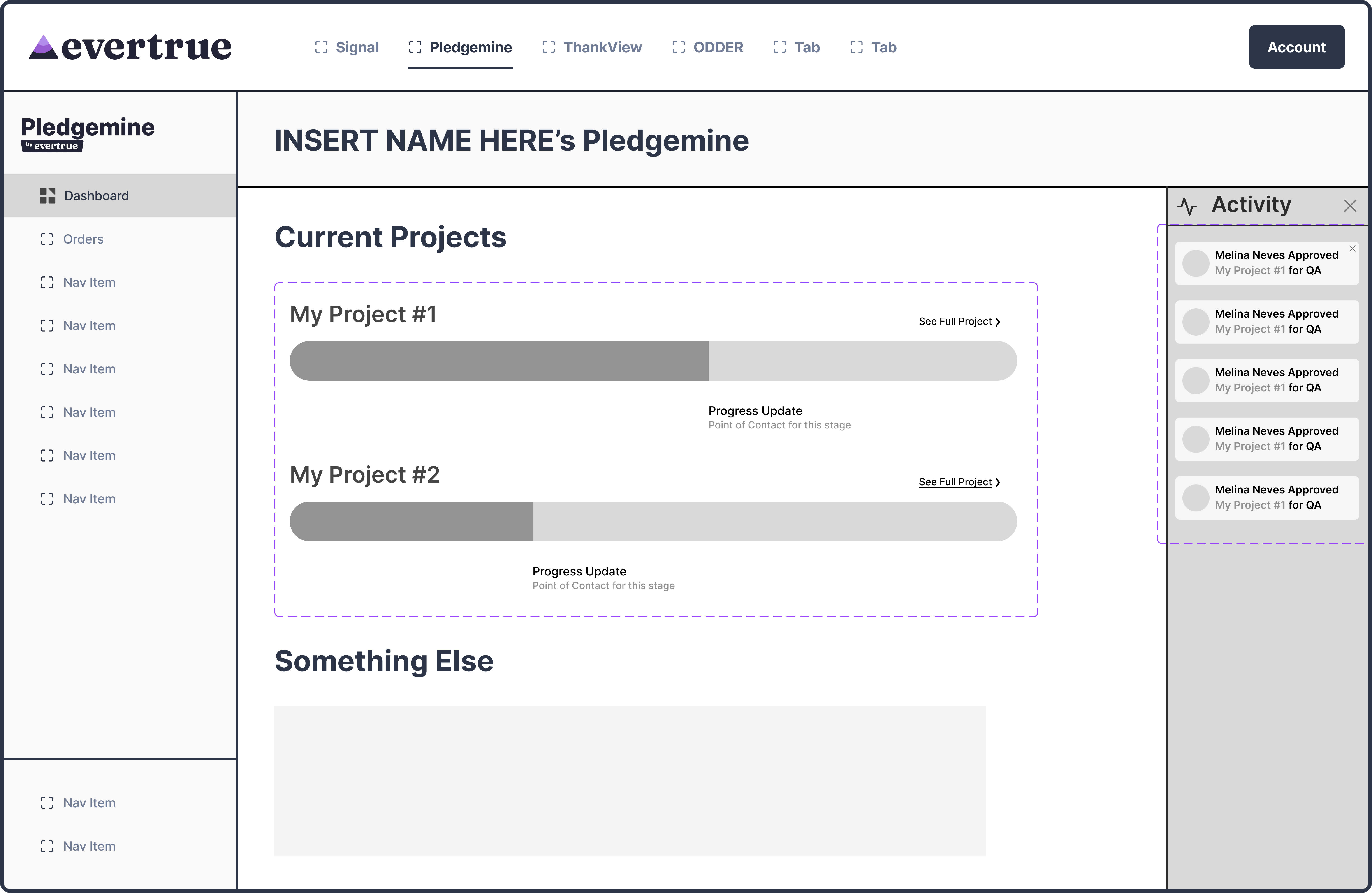
Evertrue’s flagship product is a donor experience platform called Signal. One of the big addages at Evertrue is that “Signal is everything,” as Evertrue moves toward further integration of all their products. We wanted to encourage this continued integration with our work on Pledgemine, and came up with a way for Signal’s AI assistant to suggest Pledgemine-related tasks to Signal users.
User Problem
✔As a person who owns both Pledgemine and Signal
✔I want to be able to more easily move between Evertrue products and see them working together to make my life easier
✔Because I am busy and want things to be efficient, and I think that if all the products are under the Evertrue umbrella, they should be able to work together
✔But right now the Evertrue products are all separate from one another and there is little integration between the different products my organization owns
✔Which makes me feel I’m not unlocking the full potential of the products I have bought