Perpetual Motion People

Album Art Redesign, Packaging


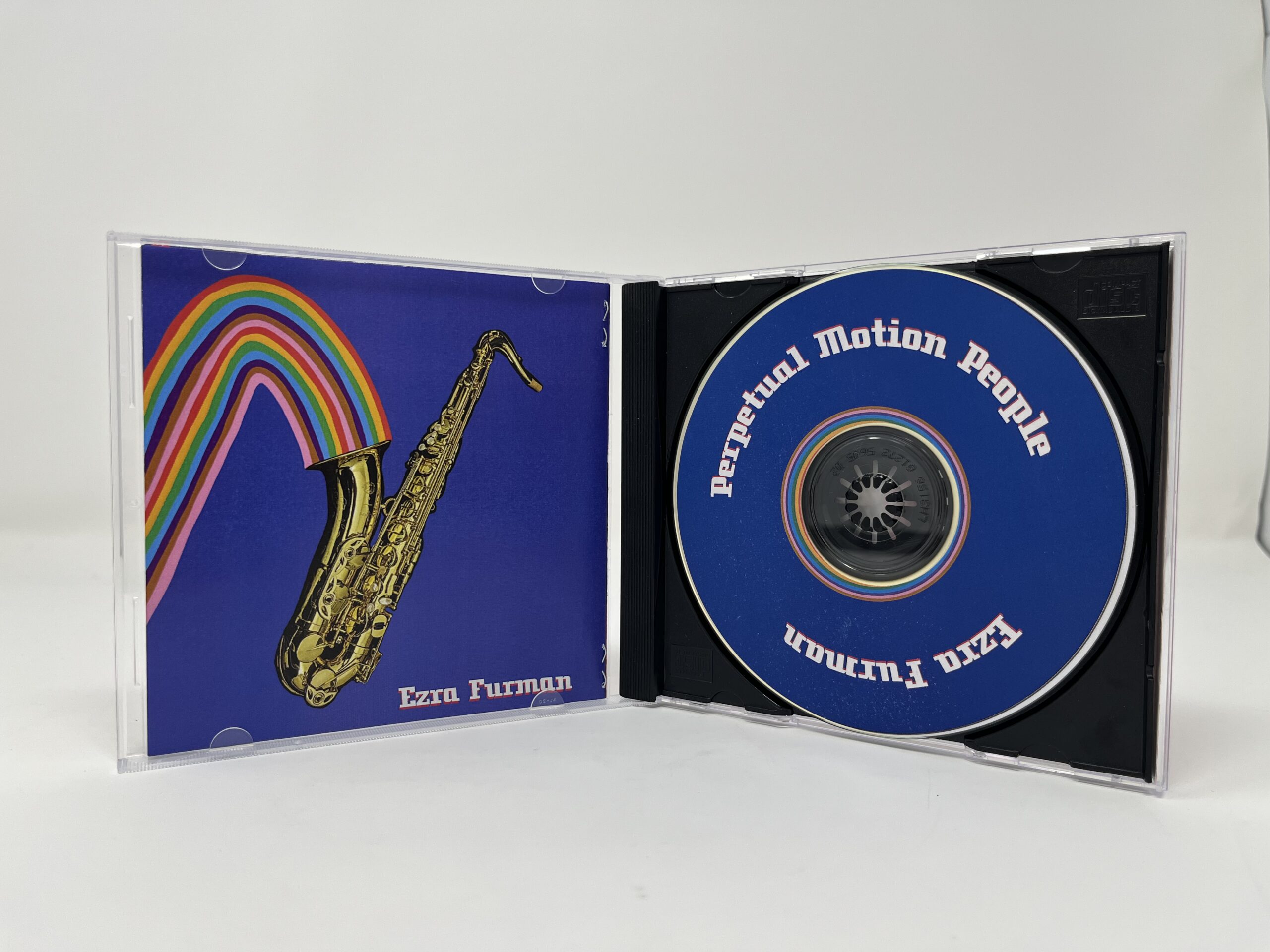
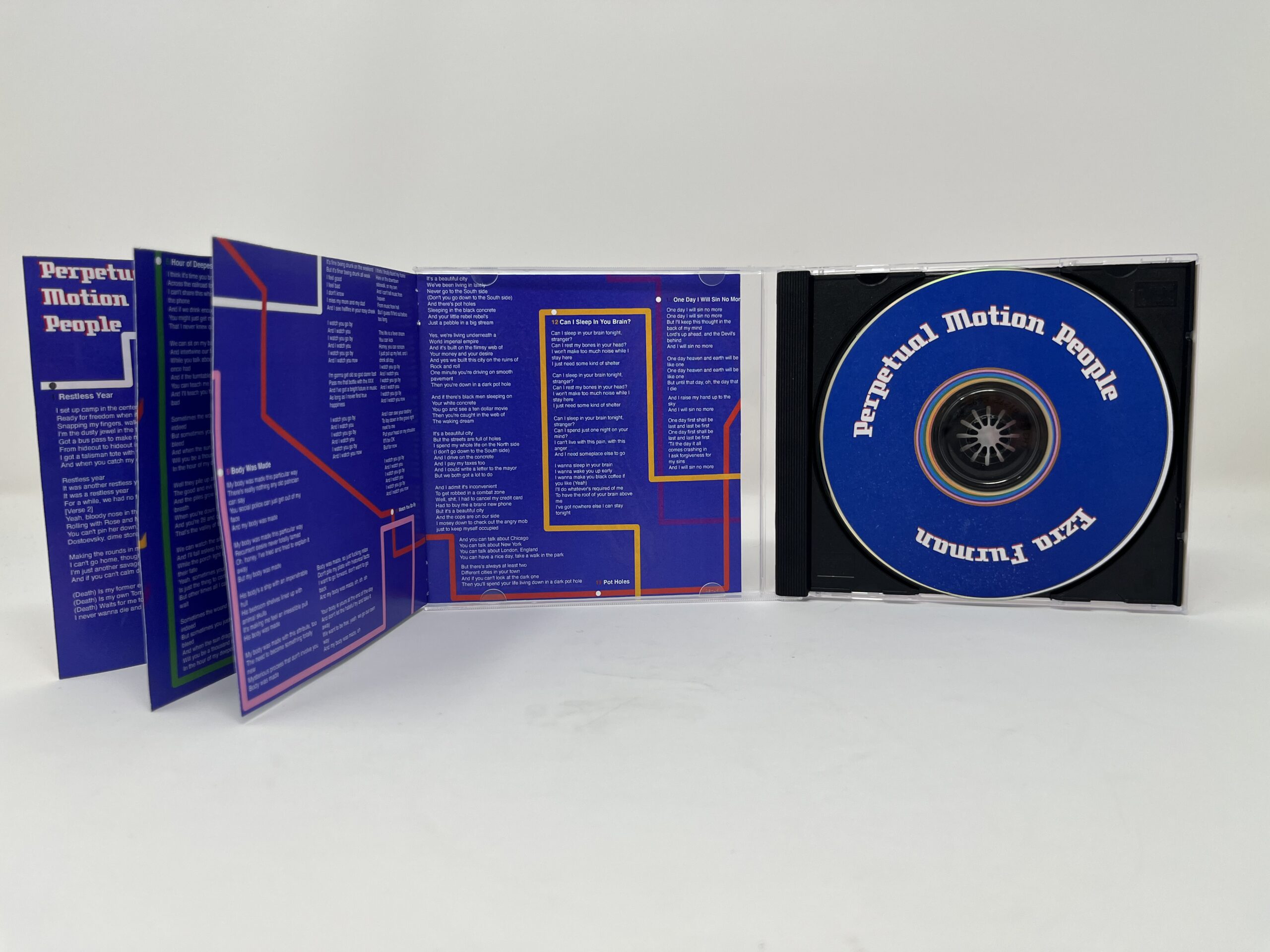
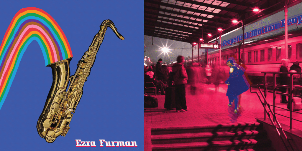
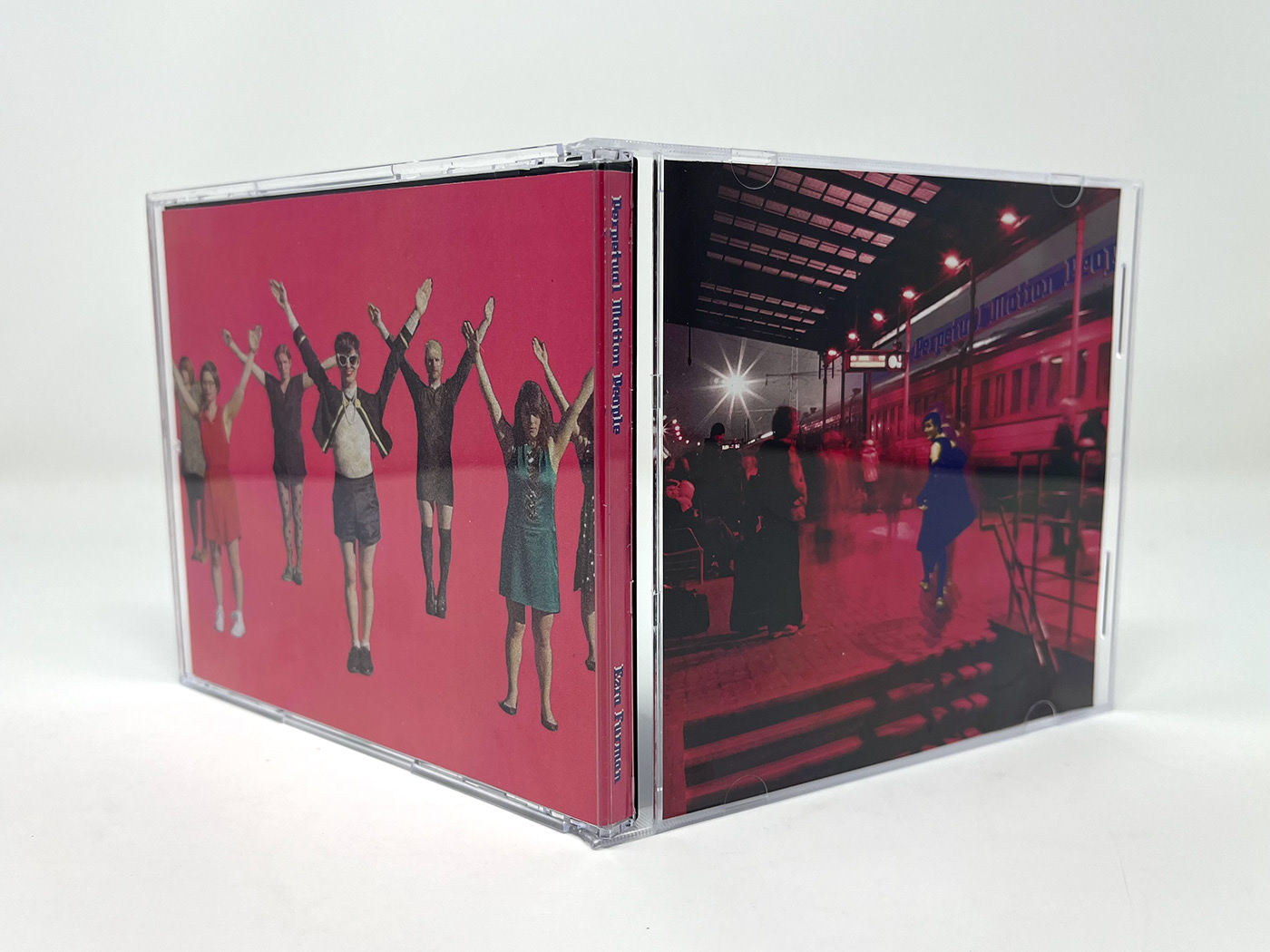
This project was a redesign of Ezra Furman’s album Perpetual Motion People. The design emulates her unique brand retro-contemporary rock n’ roll. The design also calls to the Chicago metro system, the rainbow graphics utilizing colors from CTA maps. The metro motif evokes the motion that comes with living in a city (in Ezra’s case, Chicago), which is one of the album’s primary themes,. 
Credits: Photography & Lyrics by Ezra Furman

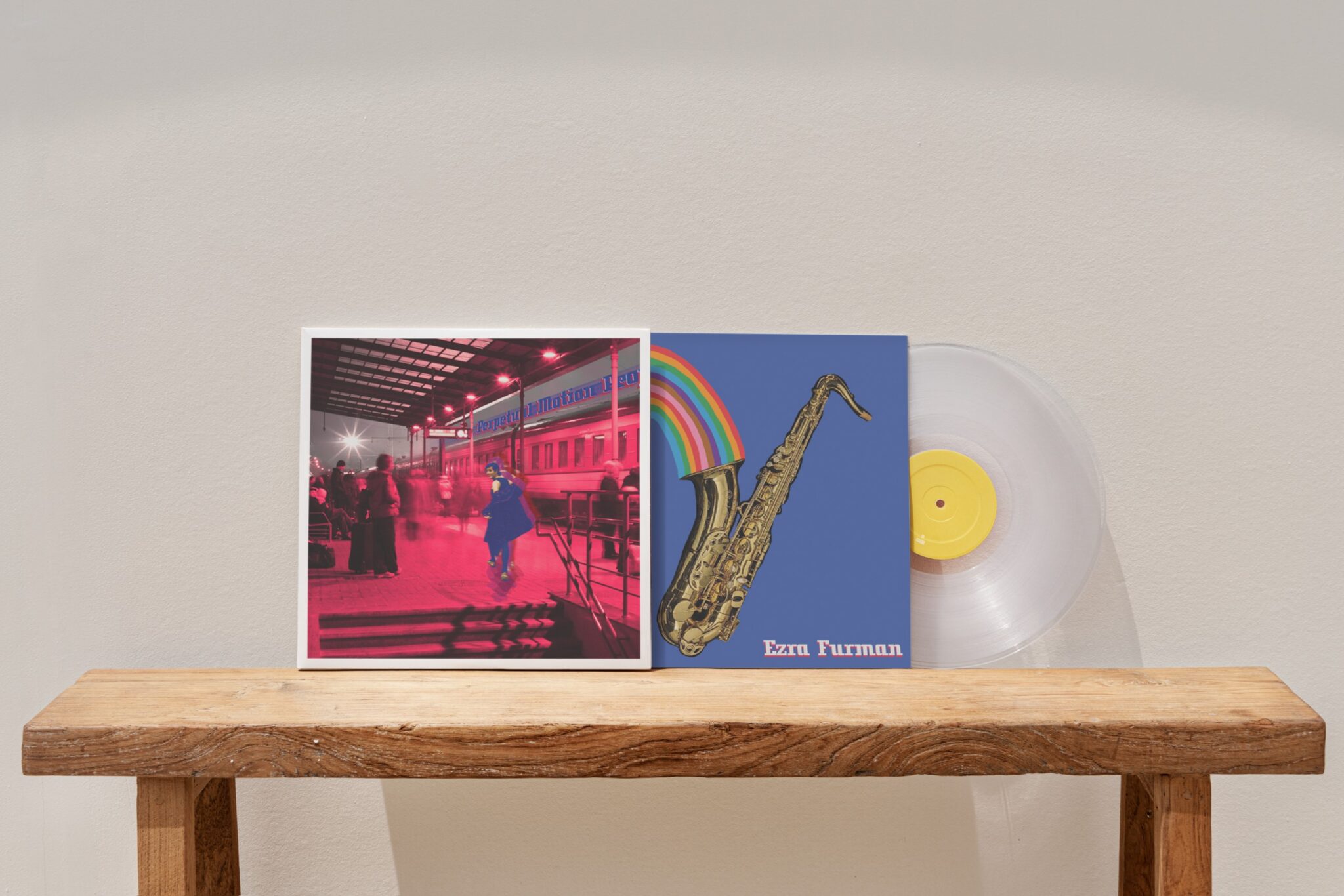
photo of a vinyl record with the redesigned cover of "Perpetual Motion People." Ezra Furman runs through a pink tinted train station with the words of the album title, zooming above her above near a train, parked in a station

This project was a redesign of Ezra Furman’s album Perpetual Motion People. The design emulates her unique brand retro-contemporary rock n’ roll. The design also calls to the Chicago metro system, the rainbow graphics utilizing colors from CTA maps. The metro motif evokes the motion that comes with living in a city (in Ezra’s case, Chicago), which is one of the album’s primary themes,. 
Credits: Photography & Lyrics by Ezra Furman

the front and back cover of the redesigned perpetual motion people album, with a saxophone spouting a rainbow on a black background on the left, and the album cover described above n the right